Frontend Framework
Requests
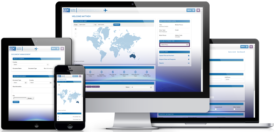
As CDC Global Travel is an application used all over the world, there was great emphasis on the app being optimized for very low-broadband areas in developing
nations. In addition, a mobile-ready framework was desired as more than half of web traffic now comes from mobile devices.
Approach
With such an emphasis on the framework being lightweight, a decision was made to opt out of using the popular Bootstrap framework for a more refine solution.
Upon review of several lightweight frameworks, Skeleton Responsive CSS Boilerplate seemed most ideal. The framework is self-described as “Light as a feather at
~400 lines & built with mobile in mind.” In fact, Skeleton does not actually consider their solution a framework, but rather a starting point. This was particularly
attractive as we were looking for the driest fronted code possible.
Results
We have not once looked back at opting out of Bootstrap. The decision to utilize Skeleton CSS and code the rest as needed proved to be very effective during the
production and in meeting requirements. Our final payload for the Skeleton CSS file is ##kb and the un-minified document is only 1500 lines (double spaced).
 By Matt Byrnes


 Make no assumptions when trying to discover an optimal user experience for a client. Try not to let the client make any assumptions either. Often, they have become so used
to protocols that they have a hard time imagining them being significantly different. They will have a list of desires and many will provide the right direction. However, knowing
what’s better is far different from knowing what’s best. Finding what’s best can often be accomplished through a qualitative approach. Interviewing, observing and focusing on the
issues they can’t quite put in to words.
 It can be a little tricky finding the right place for UI/UX process in the agile workflow. Designers have to be simultaneously assisting in the completion of sprint objectives while keeping an
eye on the big picture. Focusing only on the requirements of a particular sprint can lead to short sidedness and neglect of larger holistic design questions. Being too far removed from the development
team can be contradictory of the Agile methodology, making the process a type of mini-waterfall.